Experimenting with paper, inks, stamps, paints, fabrics, stitches, metal..........

Experimenting with paper, inks, stamps, paints, fabrics, stitches, metal..........

Saturday, 12 July 2014

Wedding Invitations


A thoroughly enjoyable few months were spent early in the year, designing, preparing and making invitations with my friends for their wedding.

The bride had been pinning ideas to Pinterest, so I set up an account to keep track of this and come up with some ideas based on the pins.  With this fantastic virtual mood board to go over, we discussed some options; how easy things would be to make in large numbers, what colours to use, what images, which stamps I already had that would work etc., etc.


Stamps
The invitations were going to have some Chinese style elements - plum blossom branches and Chinese lanterns in orange and turquoise.  Stamps from my collection were suitable, a Claritystamp (plum blossom), a little flower from a Stampin' Up! set and Chinese lanterns from Artemio - a two part stamp, one part for the outline and one for the colour block.

The invitation for the day ceremony and afternoon tea would take the form of a card with a printed, decorated insert and a pocket containing an RSVP postcard and information on the venues. Both were decorated with stamped images, all tying in with each other, but not all the same.  The evening invitation was a single A5 printed and decorated sheet matted onto coloured card.

I stamped some mock ups of the invitation components, worked out the sizes of the cards and the space available for the decoration.

Drafts
The stamping was all done in black with accent colours being applied roughly, using Distress Ink and markers (Spiced Marmalade and Broken China).  The drafts got the thumbs up, and with some playing around with rounding off the corners and the addition of a decorated panel on the front of the main daytime invitation the final design was approved!

The biggest discussion came over the choice of card colour.  A large box of orange card was purchased as a back-up to the greeny-blue-turqoise-teal which was proving quite difficult to get hold of in just the right colour.  After lots of samples, 'tempting turquoise' from Stampin' Up! was selected, which had the bonus of matching ink pad colour. 

The Final Colour Choice
Building up the decoration on the daytime invitation insert was achieved by stamping the images in black waterbased dye ink.  The clear stamps are excellent for positioning as you see exactly where you are stamping.

Plum Blossom stamped on the right of the insert

Some larger flowers were added
The outline of the lantern was stamped 'hanging' from the blossom branch.


Then the colour of the lantern was applied using the second part of the stamp inked up with colour.


A couple of attemps at the pocket went in the bin, but once I was happy with one, I made a template for the rest, including a second one to help punch the half circle in the top of the pocket in directly in the centre.  The folds were made along scorelines made using the scoreboard.  Once scored and folded all the pockets went under some heavy books for a couple of days to flatten them out completely.


All the individual elements of the invitaitons that required printing, were cut and printed (thankfully) by the groom, then I decorated each one with the stamps and some colour (Spiced Marmalade Distress Ink and Stampin' Up! in Tempting Turquoise).  Here's how the decoration for each element looked;

RSVP Postcard
The line stringing the lanterns together was drawn in by hand using a fine line marker.  A postcard image was stamped on the reverse.

Reverse of RSVP
 
Information Card
 
Evening Invite

So, with the elements made, all we had to do was finish some colouring, round some corners, score some card and put it all together.  We had a little production line in mind.........


I really liked the look of the final daytime invitation with all the elements together, the pocket was a great idea.


Sunday, 16 March 2014

Stamp Carving

Adigraf plastic cutting block is a thick flexible sheet of plastic designed for creating printing blocks.  It requires no preparation before carving like lino, which needs to be warmed with an iron to make it maleable enough to carve.  Pieces can be cut to size with scissors and standard lino cutting tools with a selection of cutter sizes allowed easy carving.

I worked on a cutting mat while carving.  Other equipment and materials used were tracing paper, graph paper, a soft pencil, marker pen, craft knife and scissors (the cutting block is also easy to cut).

Sketching out some layouts for an ATC swap I  designed some lettering for the cards - 'flora'  'fauna' and 'atc' using graph paper.  Rembering you have to carve a reverse image, the lettering was transcribed to tracing paper and transferred from the tracing paper onto the plastic with a pencil. 


Swapping the sizes of cutter depending on whether fine detail or larger areas were being cut, a little experimenting was needed to gauge how deep to cut and how much pressure is required, so it is worth carving some test pieces, if only to save your fingers.


First carving attempts......


....and this is how they stamp (this is the back of the ATC)
I love the way the imperfections of the carving end up leaving little spots and flecks of ink when the image is stamped, it gives a 'handprinted' feel.

The finished cards made for the art swap, mixed the handcarved stamps with a selection of other rubberstamps, inks, some drawn embellishments, punched shapes and pre-printed images of different flora and fauna.


The handcarved stamp gave a much clearer image when using permanent ink such as Versafine or Archival.  Waterbased dye ink tended to pool on the material, so didn't stamp as well.  It depends on what type of finish you are looking for. 
 
With some of the stamping I used a fibre tipped pen to highlight the lettering.


After I posted the carvings and images on Facebook some talented ladies at EmilyLoves and Urbanknitter asked me to carve some stamps for them.  Looking through their photos I came up with a couple of designs. 

Initial Carve
Getting very impatient to see how the stamp looks, I usually do a few test stamps along the way.  During the later carving it helps to identify any little bits of rubber making marks you don't want in the final print.

The carving of 'Y' and 'E' seem to be a bit of a challenge.  On the Emily Loves stamp, though, I do like the lack of uniformity in the letters, it reflects the stitched label I trying to copy.

Final Stamp and Image
The stencil style lettering of Urbanknitter, I thought would be easier to carve.  It wasn't.  Trying to keep the lines really straight was a problem as the plastic tends to 'squish' as you are carving it.  The tricky letter on this one was 'K'. 

Test Print
After this test print it was really tempting to leave the carve at this point, without removing the remaining plastic to the right of the heart. You can get some really interesting images and patterns around the lettering during the carving.

I like the finished stamp though, it was definitely a bit distressed and grungy in style. 

Finished Stamp and sketches for Urbanknitter

Urbanknitter's Photo of the Stamps and Packaging
I also had a go at a stamp for me, so here is my Crafter's Laboratory stamp.  I cut this much more roughly, not bothering too much about cutting too far on the joins of the letters and even left bits of edges of the plastic top and bottom.


This is the material I will be trying to carve next.  Speedball produce a rubber sheet about 1cm thick designed for carving, called 'Speedy-Carve'.  It will be interesting to see how stamps carved from this material differ from the Adigraf sheet.


Thursday, 6 March 2014

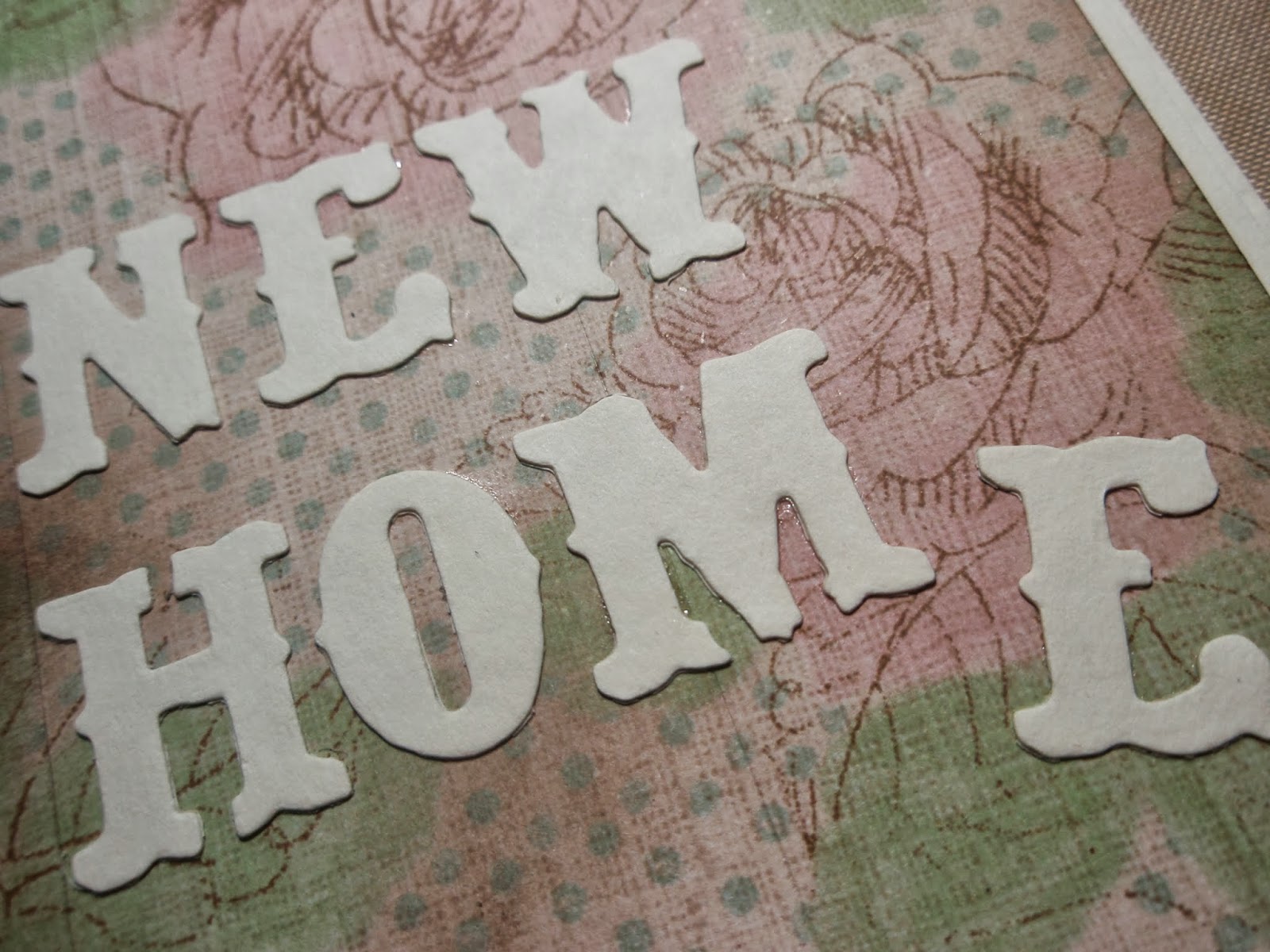
New Home Card


A 'New Home' card modelled on a tatty old wall with peeling, dirty wallpaper.


A piece of scrapbook paper which reminded me of wallpaper was stuck onto a piece of card with PVA, then a few strips of the paper were peeled away and curled.  Where the cream card was exposed under the paper, a scrap of some brown patterned paper was ripped into a rough shape to fit the gap and stuck down with PVA.


With a steel edged ruler and an awl. Lines were scored at regular intervals across paper to mimic the joins in wallpaper.  Along one of the score lines some of the pattern paper was lifted and torn.

Using some foam, brown Distress Ink (Walnut Stain) was applied around the patterned paper, especially over the torn and roughed up areas.  A void where a picture frame hangs was created by cutting a Post-It in the shape of the picture frame, sticking it to the paper and inking over the top.


An image for the picture frame was also 'aged' with the Walnut Stain ink.


The picture frame was prepared using Ultra Thick Embossing Enamel (UTEE) of various marbled colours poured from a melting pot into a silicon mould.  This was mounted with glue gel over the aged picture, at an angle to the 'clean' area of the fake wallpaper.  An old gold brad created the picture hook and the chain was drawn in by hand with fibre tipped pen.


To finish off the card, NEW HOME letters were cut from cream card using a die and stuck to the front.


The panel was then mounted onto a card folded from an A4 sheet of cream card.

Monday, 3 March 2014

The Colour Red

The Colour Red ATC Swap - February 2014
Productivity has been fairly low lately - although I have been working on some wedding invitations which I'm not allowed to share for a while yet.

However, with a little inspiration from Blue Jelly Stampin  and some free stamps from the cover of 'Get Stamping' magazine Issue 7, I got to work on my first ATC swap of the year.


The free stamps with the magazine were really good quality clear stamps and the sheet of nineteen stamps all had an Oriental theme.


Blue Jelly's layout in the magazine had some really fun co-ordinated ideas for a party using the free stamps, including bunting, party bags and table decorations.


The ATC swap this month, was with the theme 'The Colour Red'.  This always make me think Oriental, so with my hands on the freebies from the magazine, I got to work on a few cards for the swap.

With only a little time left to get my cards in for the swap, I kept the ATCs really simple.  The main images were stamped onto white card in Versamark ink and heat embossed with black embossing powder.  The intensity of black you get with a heat embossed image is a great contrast to the red.

Red Distress ink was applied with a foam applicator to each card for the backgrounds, more ink was applied to the edges to get a deeper colour.


Added to the backgrounds were stamps of tiny cherry blossoms from the magazine stamp set and a couple of starburst stamps from Hero Arts (Single Starburst, wooden block) in the same red ink.


Different shades of red ink were applied using fibre tipped and gelli pens to the open areas, like some of the cherry blossoms, lanterns or parts of the Zentangle stamp.


The lanterns were stamped and embossed on a separate piece of card, coloured with red ink and cut out.  These were then mounted overlapping each other using dimensional glue gel.


My favourite one of the four is the crane.  This card isn't actually going off to the swap, but will hopefully still find it's way to a special member of our swap group.